• Home
  • About
  • Services
    Branding DesignGraphic DesignUI/UX DesignMotion GraphicVideo Editing
  • Portfolio's
    Branding DesignGraphic DesignUI/UX DesignMotion GraphicVideo Editing
  • Pages
    BlogsFAQ
HomeAbout
Services
Branding DesignGraphic DesignUI/UX DesignMotion GraphicVideo Editing
Portfolio's
Branding DesignGraphic DesignUI/UX DesignMotion GraphicVideo Editing
Pages
BlogsFAQ

Follow Us On

Let's Talk

Address

Chandpur, Chittagong, Bangladesh

ZIP Code: 3600

Follow Us On
Company
  • About Us
  • Our Team
  • Work Process
  • Our Clients
  • Review
  • Privacy Policy
Our Services
  • All Services
  • Branding Design
  • Graphic Design
  • UI/UX Design
  • Motion Graphic
  • Video Editing
Portfolio's
  • Branding Design
  • Graphic Design
  • UI/UX Design
  • Motion Graphic
  • Video Editing
Links
  • Blogs
  • FAQ
  • Contact
Address
Chandpur, Chittagong, Bangladesh
ZIP Code: 3600
Follow Us On
© 2025 All Rights Reserved by Legoon Pixel
Live Chat
  • Home
  • About
  • Services
    Branding DesignGraphic DesignUI/UX DesignMotion GraphicVideo Editing
  • Portfolio's
    Branding DesignGraphic DesignUI/UX DesignMotion GraphicVideo Editing
  • Pages
    BlogsFAQ
HomeAbout
Services
Branding DesignGraphic DesignUI/UX DesignMotion GraphicVideo Editing
Portfolio's
Branding DesignGraphic DesignUI/UX DesignMotion GraphicVideo Editing
Pages
BlogsFAQ

Follow Us On

Let's Talk

Responsive vs. Adaptive Design

Responsive vs. Adaptive Design: Which is Right for Your Website?

September 04, 2023

  • 5 min read
Responsive vs. Adaptive Design: Which is Right for Your Website?

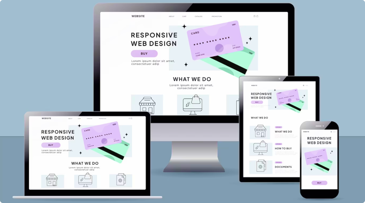
In the digital age, ensuring that your website is accessible and visually appealing across various devices and screen sizes is essential. Two popular approaches for achieving this are responsive and adaptive web design. Each method has its own set of advantages and disadvantages, making it crucial to choose the one that aligns with your specific needs. In this blog post, we'll explore responsive and adaptive design and help you determine which one is right for your website.

Responsive vs. Adaptive Design: Which is Right for Your Website?
Address

Chandpur, Chittagong, Bangladesh

ZIP Code: 3600

Follow Us On
Company
  • About Us
  • Our Team
  • Work Process
  • Our Clients
  • Review
  • Privacy Policy
Our Services
  • All Services
  • Branding Design
  • Graphic Design
  • UI/UX Design
  • Motion Graphic
  • Video Editing
Portfolio's
  • Branding Design
  • Graphic Design
  • UI/UX Design
  • Motion Graphic
  • Video Editing
Links
  • Blogs
  • FAQ
  • Contact
Address
Chandpur, Chittagong, Bangladesh
ZIP Code: 3600
Follow Us On
© 2025 All Rights Reserved by Legoon Pixel
Live Chat

Responsive Design: Flexibility for All Devices

Responsive web design is an approach that creates a single website that automatically adjusts its layout and content to fit the screen it's viewed on. This design method uses flexible grids and elements that adapt to the screen size, making it suitable for a wide range of devices, from desktop computers to smartphones.

Advantages of Responsive Design:

Universal Compatibility: Responsive design ensures that your website is accessible to all users, regardless of the device they use.
Cost-Effective: It can be more cost-effective since you're maintaining a single website with one set of content.
Easier Maintenance: Updates and maintenance are streamlined since you only need to manage one site.
Better SEO: Google and other search engines favor responsive websites, which can boost your search engine rankings.

Advantages of Responsive Design:

Adaptive Design: Tailoring Experiences for Different Devices

Adaptive web design, on the other hand, involves creating multiple versions of a website, each specifically optimized for different devices or screen sizes. When a user accesses the site, it detects their device and loads the appropriate version.

Advantages of Adaptive Design:

Optimized Performance: Adaptive design can provide better performance as it tailors the content and layout to the user's device, ensuring faster load times.
Customization: You have more control over the user experience, allowing you to tailor content and features to specific devices.Enhanced User Experience: Users receive a website that's specifically optimized for their device, resulting in a better experience.
Offline Functionality: Adaptive websites can be designed to work offline or in low-bandwidth situations.

Advantages of Adaptive Design:

Choosing the Right Approach

To decide between responsive and adaptive design, consider the following factors:
Target Audience: Think about your primary audience and the devices they use. If your audience primarily uses one type of device, you might lean toward that design approach.

Content and Features: Consider the content and features on your website. Do they need to be consistent across devices, or can they be optimized differently for each?

Budget and Resources: Your budget and the resources available for web design and maintenance can impact your choice. Responsive design can be more cost-effective for smaller businesses.

SEO Goals: If strong search engine optimization is a priority, responsive design may be more favorable due to its SEO benefits.

Performance: Evaluate the performance needs of your website. Adaptive design may be a better choice if your site requires optimal performance for specific devices.

Choosing the Right Approach

Conclusion

Both responsive and adaptive design are effective strategies for creating a user-friendly, cross-device web experience. The choice between the two depends on your target audience, content, budget, and performance requirements. Whichever approach you choose, the key is to ensure that your website delivers a seamless and engaging experience, regardless of the device your visitors are using.